I’ve been exploring the wonderful world of open data, and have found that most cities offer up files with surprising levels of detail. Not all of these files are created equally though, and almost none are the .SVG that we know and love here. This particular project started as three shape files (.SHP) from OpenDataPhilly.

Taking a shape file and converting to a .SVG is a fairly straightforward process. This method will get you an .SVG that etches nicely onto a surface, but I wanted to cut mine out instead.
To groom the resulting .SVG, I thickened all the strokes to ~200%. I did this to maintain the relative thickness differences between highways, arterial streets, and capillary streets. I then converted strokes to paths and made the new strokes (which outlined the boundary of the original stroke) 0.1 mm thick. Now I had streets that connected the entire map bounded by very thin strokes to cut.
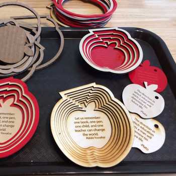
If this method doesn’t provide good results, then scale up your map ~10,000%, use the inset path function several times, and scale it back down. Scaling the project up will prevent goofy rounding errors like the ones you see on the inner rings of these figures. With the fine details of these maps, you want to maintain the straight lines as much as possible!
But why bother with open data and .SHP’s when I could go use the dummyproof Snazzymaps Template to get an .SVG right away??? The reason is that I am not just after the map, I am after a STORY. Combining this map with other layers of data like neighborhoods (red) or water features (blue) gives an interesting narrative the City of Brotherly Love.

This example isn’t as strong as I would like, but I plan to delve into other more provocative topics like crime, property value, litter density, and income. These data sets are all publicly available and unsurprisingly make nice contour lines akin to a topographic map. I hope to revisit this soon!
