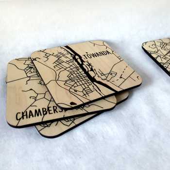
Back in April I posted Boston, part 1 in a series of maps that depict a plausible worst-case scenario sea level rise by 2100 should emissions remain unchecked. I’ve finished three more since then, and instead of posting them one at a time, I thought I’d bundle them. The light blue represents the inundated coastline and the raw wood represents the projected remaining landmasses. (There’s a lot more info about the background and process in the first post so I’m kind of glossing over it here!)

Charleston seems to be everyone’s favorite. The “new’ coastline is so complex and intricate. I decided to include the streams that meander through the marshy areas surrounding developments since the inundation followed them in many cases. I thought it told a better story, although, there were a few places where I had to exclude some small streams so the heat from the laser didn’t char everything around it.

I developed Honolulu and Key West at the same time, in part because I couldn’t figure out which I wanted to do first and in part because I couldn’t find Key West’s street data from a government source I wouldn’t have to email. I just got so annoyed I had to put it down. Hawaii has a great GIS portal but I still wound up using OpenStreetMap data for both because it was more convenient and organized a little better.
I love how the two pieces relate conceptually but are so different in composition and outcome. They are set at the same scale, I felt like that highlighted major differences in urban planning. I also cut the landmasses from the same board since there was so little left of Key West. The inundation was fairly contiguous in both maps so they’re simpler in appearance than either Boston or Charleston.

Obviously, Hawaii’s volcanic terrain provides more of a refuge from rising water, but so much of downtown Honolulu is in trouble. Like Charleston, I included major streams. This let me cheat a little on the engrave, too. I split the landmass into four chunks so I didn’t have to sit at the laser for hours. I love the composition in this one. Even if it’s not as complex as the previous two pieces, the stark contrast and balance between land and sea is unique are the series thus far.

I almost excluded Key West from my original list of cities because I thought it was too obvious and too simple. However, this series is about communicating loss. If you’re not familiar with the island, almost every part of it that isn’t a swamp, airport, or golf course is as built up as the area in the lower left. The population density is 2.5x that of Honolulu. Key West has a rich history, it’s the southernmost city in the continental US, and with a 6’ SLR it’s basically gone.
I’m not sure what’s next for the series. There are a few candidates on the West Coast and Florida is such a mess, but I’m struggling with how to handle the sprawl and differentiate between places. I don’t think I’m done, though. Despite the emotional weight of the content and the heavy-lift on the design/GIS side, they’re peaceful to work on.
Not sure if there are any cartographers on the forum, but I’ll be speaking on the series at NACIS this year, either the 15th or 16th. Tune in if you’re not on another track!
